
Data about data quality. It doesn’t get more meta than this.
Measuring data is likely a better title than measuring data quality and I suggest combining quality with productivity and engagement metrics. At its core, measuring data can be boiled down to:
Key data metrics = data quality + productivity + engagement
Why measure data quality?
What you can’t measure you can’t improve. Or that’s how the old saying goes. I’m not convinced it’s actually true and being overly obsessed with metrics is likely to lead you astray.
However, there are plenty of good reasons to measure key data metrics. Here are a few:
Because some data is really important. If you’re a fintech company you may be required to submit data to regulators or you use data to decide who should be allowed to sign up for your product. If you’re a SaaS company you may have some data that decides which bill end-users get at the end of the month. This is data you want to get right and if you don’t it can get really ugly (one such example is Facebook charging advertisers too much due to overcounting).
Because measuring data quality helps set high standards for your data team. A Looker dashboard not being updated before 9:00 a.m. when the C-level team looks at the KPIs or frequently being told about data issues by stakeholders before you identify them are both examples that reduce trust in data. Measuring data quality can help you be scientific about this and be proactive about where to improve controls.
So you know where to place your bets. If you have a team of analytics engineers you want them to work on the most important things. Having a clear understanding of data quality can both help you point to areas that are doing well but also highlight areas where you may want to improve.
Which metrics should you use?
There are many ideas for metrics around reducing data downtime or minimizing errors caught by end-users but these are not practical as metrics you can track every week. Instead, you should think about specific, measurable metrics that you can track and objectively evaluate yourself and your team against. I recommend grouping them into three categories.
1 – Quality: These metrics help you understand the quality and timeliness of your data and how well you’re set up for catching issues when something goes wrong.
2 – Productivity: Time spent improving data quality is a double-edged sword and has to be balanced with also doing other strategic work. You should track how much time your team is spending on work related to data quality.
3 – Engagement: Often dashboards and data models get thrown over the fence without much consideration for who uses them. Engagement metrics help keep everyone accountable for what’s being created is also being used.
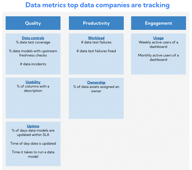
A few of my favorite metrics:
% of days data models are updated within SLA: I like this one because it gives a clear idea of when data is ready to use. If you know your execs look at the KPI dashboard each morning at 9:00 a.m., hold yourself and your team accountable for having data ready by then by setting an SLA. There’s no hiding from this.
# data test failures per week: I’ve previously written about how leaving data tests failing is akin to the broken windows theory. By putting test failures in front of your team they’ll be more likely to address them and not accept dozens or hundreds of failing tests sitting around unaddressed in a Slack channel.
Weekly active users of a dashboard: Data people should align themselves with the value they create. One of the best ways to do this is by keeping an eye on who uses a data product which in many cases is a dashboard. Not only does this give you visibility into end-user adoption, but you can also share the success with your analytics engineers or product squads to show them that the upstream work they put into data is paying off.
What’s really exciting is when you start building workflows around these metrics.
Want to improve data test coverage? Make a rule that every time someone is made aware of a data issue that was not caught by a test, they should add a new test.
Want to make your data models run faster? Make a rule that every time someone pushes code to Github, you automatically check if it impacts the run time of the data model and raise an alert if it does.
You could also schedule a weekly report of the metrics to make it competitive and hold people accountable and celebrate success by showing how much you’ve improved.
Segmenting is key
If you look at data metrics across different segments it becomes much more interesting and actionable. The following segments are particularly interesting:
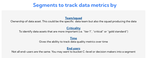
Team/Squad: If you’re part of a larger data team it’s important to break data quality down by team to understand how each one is doing. Similarly, if you have a decentralized setup with many product squads, you should try getting the data producers to take joint ownership of the data quality by sharing key metrics with them.
Criticality: Not all data should be treated the same. An error on a data model that’s only used by you and a few close colleagues may have a very different impact than an error in your top-level KPI dashboard or in a data service that powers a production-level ML system. Most teams have a way of knowing about this, for example by tagging data models as “tier 1”, “critical” or “gold standard.”
Time: You want to be able to understand if you’re improving or deteriorating data quality over time and how this looks across teams and squads.
End-users: In the same way that you segment data models by criticality, you can segment end-users. For example, you could have a filter on C-suite so you can see which dashboards they use and if they’ve been using the wrong data. Although everyone should expect great data quality, it’s often more important to pay extra attention to data that has a lot of senior people using it.
How to get started
Start with a few metrics and stick with them. Optimize for data that’s accessible and avoid creating too much manual work. For example, having people input time spent on solving data issues in a given week is too subjective and your team will get tired of it.
Be consistent and have a regular schedule of looking at the metrics. Maybe you review them in your bi-weekly data team meeting or schedule a send-out on Slack every Friday. Whichever way you go, get it in front of people regularly so it’s not just another shiny object that doesn’t get used.
If you have some stories or ideas about measuring data quality from your company, I would love to hear from you. You can reach me here.
Originally published on Inside Data